第一章:标准流
1.1 概述
- 标准流:又称
文档流(正常流、常规流),是浏览器在渲染显示网页内容时默认采用的一套排版规则,规定了应该以何种方式排列元素。 - 常见的标准流排版规则:
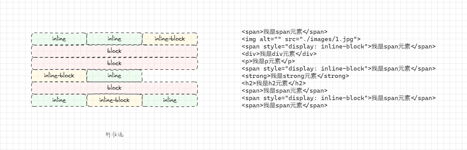
- 块级元素:从上到下,垂直布局,独占一行。
- 行内元素或行内块元素:从左到右,水平布局,空间不够自动折行。
1.2 常见元素的显示模式
块级元素(block):
- 主体结构元素:
html、body。 - 排版元素:
h1~h6、hr、p、pre、div。 - 列表元素:
ul、li、ol、dl、dt、dd。 - 表格相关元素:
table、tbody、thead、tfoot、tr、catption。 - 表单相关元素:
form、option。
- 主体结构元素:
行内元素(inline):
- 文本元素:
br、em、strong、sup、sub、del、ins、span。 - 超链接元素:
a。 - 表单相关元素:
label。
- 文本元素:
行内块元素(inline-block):
- 图片元素:
img。 - 表格相关元素:
td、th。 - 表单相关元素:
input、textarea、select、button。 - 框架元素:
iframe。
- 图片元素:
【技巧】其实,我们是可以在 Chrome 的调试工具中查看元素的默认显示模式的。
1.3 应用示例
- 需求:描述标准流
- 示例:
html
<!DOCTYPE html>
<html lang="en">
<head>
<meta charset="UTF-8">
<meta content="IE=edge" http-equiv="X-UA-Compatible">
<meta content="width=device-width, initial-scale=1.0" name="viewport">
<title>Title</title>
</head>
<body>
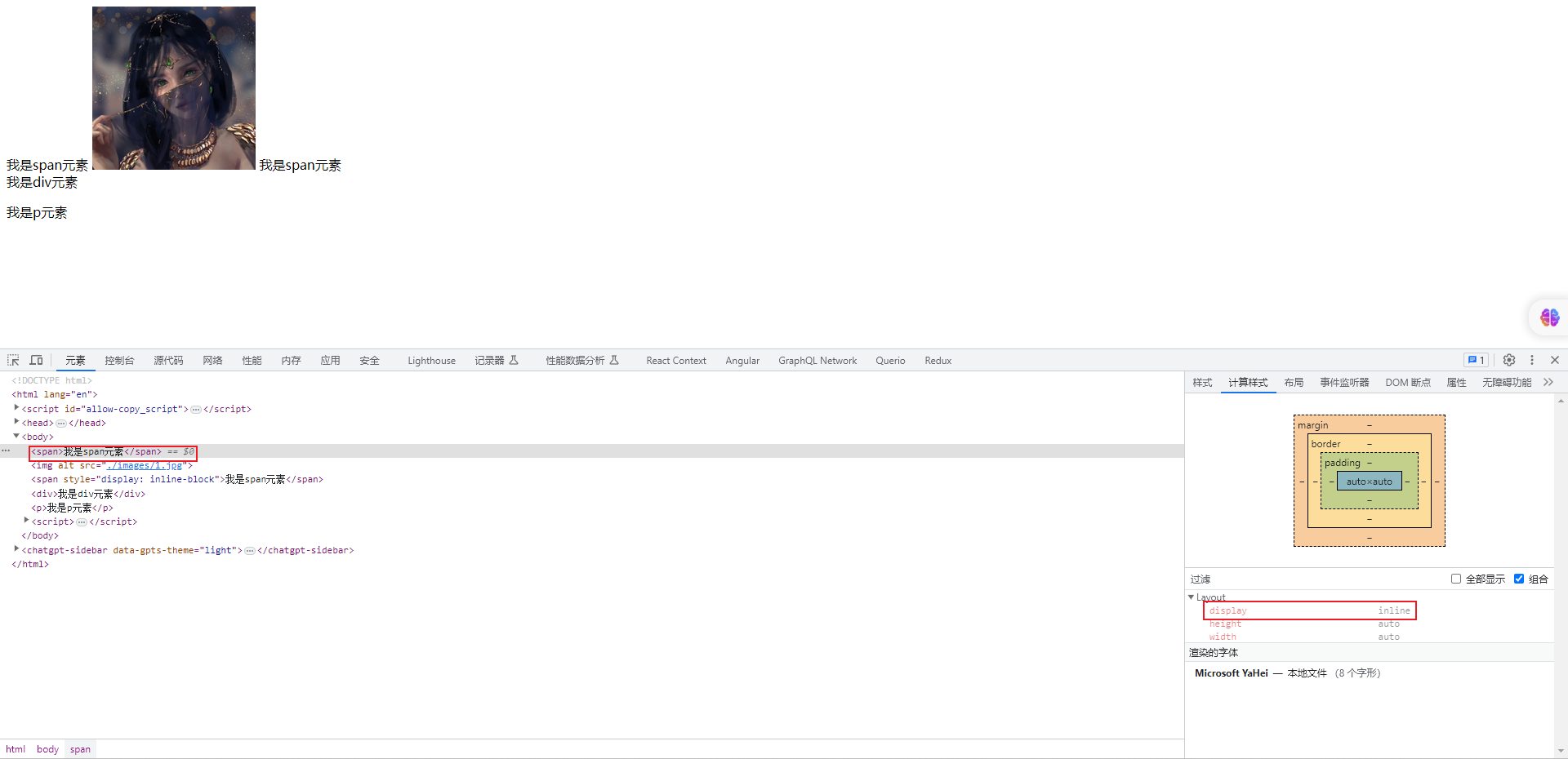
<span>我是span元素</span>
<img alt="" src="./images/1.jpg">
<span style="display: inline-block">我是span元素</span>
<div>我是div元素</div>
<p>我是p元素</p>
<span style="display: inline-block">我是span元素</span>
<strong>我是strong元素</strong>
<h2>我是h2元素</h2>
<span>我是span元素</span>
<span style="display: inline-block">我是span元素</span>
<span>我是span元素</span>
</body>
</html>第二章:浮动
2.1 元素之间的空白问题
- 其实,我们完全可以通过行内元素或行内快元素来进行布局;但是,
行内元素或行内块元素之间的换行会被浏览器解析为一个空白字符。
html
<!DOCTYPE html>
<html lang="en">
<head>
  <meta charset="UTF-8">
  <meta content="IE=edge" http-equiv="X-UA-Compatible">
  <meta content="width=device-width, initial-scale=1.0" name="viewport">
  <title>Title</title>
  <style>
    .box {

    }

    .box span {
      background-color: orange;
    }
  </style>
</head>
<body>
  <div class="box">
    <span>我是span元素</span>
    <span>我是span元素</span>
  </div>
</body>
</html>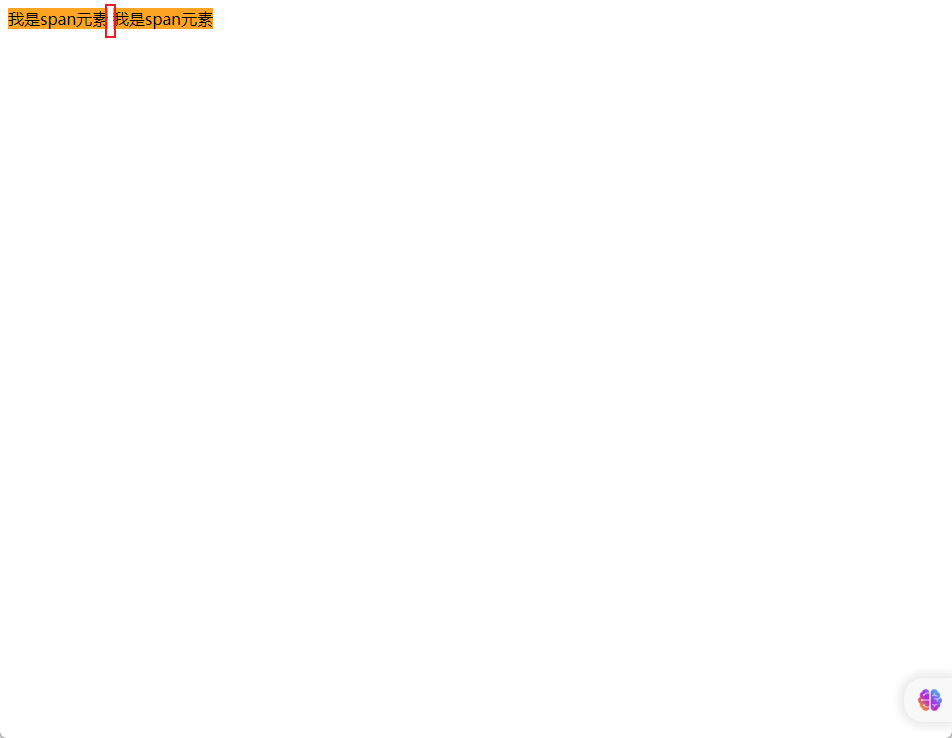
- 解决方案 ① :去掉空格或换行(不推荐)。
html
<!DOCTYPE html>
<html lang="en">
<head>
  <meta charset="UTF-8">
  <meta content="IE=edge" http-equiv="X-UA-Compatible">
  <meta content="width=device-width, initial-scale=1.0" name="viewport">
  <title>Title</title>
  <style>
    .box {

    }

    .box span {
      background-color: orange;
    }
  </style>
</head>
<body>
  <div class="box">
    <!-- 去掉空格或换行,代码看起来非常凌乱~,不推荐 -->
    <span>我是span元素</span><span>我是span元素</span>
  </div>
</body>
</html>- 解决方案 ② :给父元素设置
font-size: 0 ;,再给子元素单独设置大小(不推荐)。
html
<!DOCTYPE html>
<html lang="en">
<head>
  <meta charset="UTF-8">
  <meta content="IE=edge" http-equiv="X-UA-Compatible">
  <meta content="width=device-width, initial-scale=1.0" name="viewport">
  <title>Title</title>
  <style>
    .box {
      /* 给父元素的 font-size 设置为 0  */
      font-size: 0;
    }

    .box span {
      /* 给子元素单独设置 font-size */
      font-size: 16px;
      background-color: orange;
    }
  </style>
</head>
<body>
  <div class="box">
    <span>我是span元素</span>
    <span>我是span元素</span>
  </div>
</body>
</html>- 解决方案 ③ :通过给子元素设置浮动,浮动到一个方向(浮动也会有问题,早期的解决方案)。
html
<!DOCTYPE html>
<html lang="en">
<head>
  <meta charset="UTF-8">
  <meta content="IE=edge" http-equiv="X-UA-Compatible">
  <meta content="width=device-width, initial-scale=1.0" name="viewport">
  <title>Title</title>
  <style>
    .box {

      font-size: 0;
    }

    .box span {
      /* 给子元素设置浮动,并且浮动到一个方向 */
      float: left;
      background-color: orange;
    }
  </style>
</head>
<body>
  <div class="box">
    <span>我是span元素</span>
    <span>我是span元素</span>
  </div>
</body>
</html>- 解决方案 ④ :Flex 布局(目前还没学习,后面会学习~)。
html
<!DOCTYPE html>
<html lang="en">
<head>
  <meta charset="UTF-8">
  <meta content="IE=edge" http-equiv="X-UA-Compatible">
  <meta content="width=device-width, initial-scale=1.0" name="viewport">
  <title>Title</title>
  <style>
    .box {
      display: flex;
    }

    .box span {
      background-color: orange;
    }
  </style>
</head>
<body>
  <div class="box">
    <span>我是span元素</span>
    <span>我是span元素</span>
  </div>
</body>
</html>2.2 浮动的作用
- 早期的作用:图文环绕。
html
<!DOCTYPE html>
<html lang="en">
<head>
  <meta charset="UTF-8">
  <meta content="IE=edge" http-equiv="X-UA-Compatible">
  <meta content="width=device-width, initial-scale=1.0" name="viewport">
  <title>Title</title>
  <style>
    .box {
      width: 500px;
      height: 300px;
      background-color: pink;
    }

    .box img {
      float: left;
    }
  </style>
</head>
<body>
  <div class="box">
    <img alt="" src="./images/1.jpg">
    Oracle Java 是广受欢迎的编程语言和开发平台。它有助于企业降低成本、缩短开发周期、推动创新以及改善应用服务。如今,Java
    仍是企业和开发人员的首选开发平台,全球有数百万开发人员运行超过 60 亿台 Java 虚拟机。
    Oracle Java 是广受欢迎的编程语言和开发平台。它有助于企业降低成本、缩短开发周期、推动创新以及改善应用服务。如今,Java
    仍是企业和开发人员的首选开发平台,全球有数百万开发人员运行超过 60 亿台 Java 虚拟机。
    Oracle Java 是广受欢迎的编程语言和开发平台。它有助于企业降低成本、缩短开发周期、推动创新以及改善应用服务。如今,Java
    仍是企业和开发人员的首选开发平台,全球有数百万开发人员运行超过 60 亿台 Java 虚拟机。
  </div>
</body>
</html>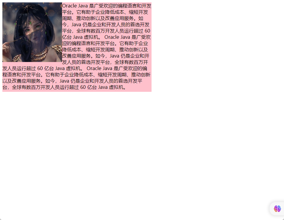
- 现在的作用:网页布局(让垂直布局的盒子变为水平布局,如:一个向左,一个向右)。
html
<!DOCTYPE html>
<html lang="en">
<head>
  <meta charset="UTF-8">
  <meta content="IE=edge" http-equiv="X-UA-Compatible">
  <meta content="width=device-width, initial-scale=1.0" name="viewport">
  <title>Title</title>
  <style>

    .box div {
      width: 200px;
      height: 200px;
    }

    .box .left {
      float: left;
      background-color: pink;
    }

    .box .right {
      float: right;
      background-color: skyblue;
    }
  </style>
</head>
<body>
  <div class="box">
    <div class="left">左护法div</div>
    <div class="right">右护法div</div>
  </div>
</body>
</html>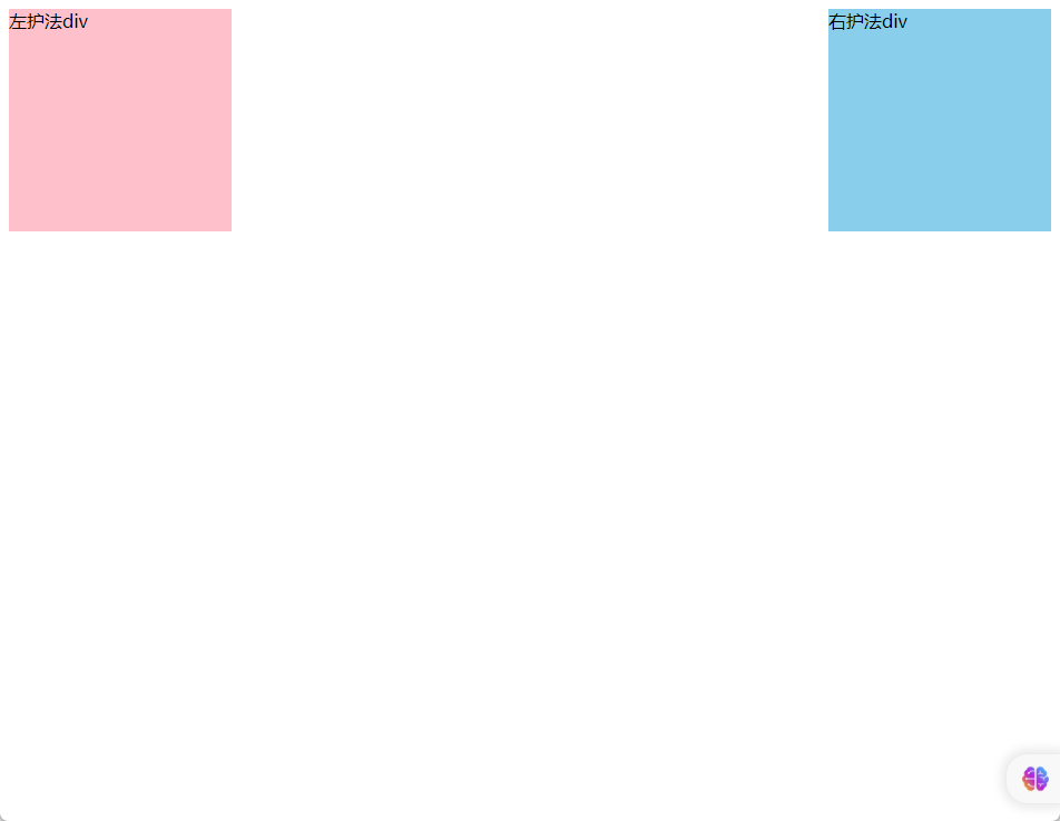
2.3 浮动的语法
float属性用于创建浮动框,将其移动到一边,直到左边缘或右边缘触及包含块或另一个浮动元素的边缘。语法:
css
选择器 { float:属性值; }| 属性值 | 描述 |
|---|---|
| none | 元素不浮动(默认值) |
| left | 元素向左浮动 |
| right | 元素向右浮动 |
- 示例:
html
<!DOCTYPE html>
<html lang="en">

<head>
  <meta charset="UTF-8">
  <meta content="IE=edge" http-equiv="X-UA-Compatible">
  <meta content="width=device-width, initial-scale=1.0" name="viewport">
  <title>Document</title>
  <style>
    div {
      width: 200px;
      height: 200px;
    }

    .box1 {
      float: left;
      background-color: pink;
    }

    .box2 {
      float: left;
      background-color: skyblue;
    }
  </style>
</head>

<body>
  <div class="box1"></div>
  <div class="box2"></div>
</body>

</html>2.4 浮动的特点
① 浮动元素会脱离标准流(简称:脱标),在标准流中不占位置。
② 不管浮动前是什么元素,浮动后:默认宽与高都是被内容撑开(尽可能小),而且可以设置宽高。
③ 不会独占一行,可以与其他元素共用一行。
④ 不会 margin 合并,也不会 margin 塌陷,能够完美的设置四个方向的 margin 和 padding 。
⑤ 不会像行内块一样被当做文本处理(没有行内块的空白问题)。
示例:盒子 1 右浮动
html
<!DOCTYPE html>
<html lang="en">

<head>
  <meta charset="UTF-8">
  <meta content="IE=edge" http-equiv="X-UA-Compatible">
  <meta content="width=device-width, initial-scale=1.0" name="viewport">
  <title>Document</title>
  <style>
    .outer {
      width: 500px;
      background-color: gray;
      border: 1px solid black;
    }

    .box {
      width: 200px;
      height: 200px;
      background-color: skyblue;
      border: 1px solid black;
      margin: 10px;
    }

    .box1 {
      float: right;
    }
  </style>
</head>

<body>
  <div class="outer">
    <div class="box box1">1</div>
    <div class="box box2">2</div>
    <div class="box box3">3</div>
  </div>
</body>

</html>- 示例:盒子 1 左浮动
html
<!DOCTYPE html>
<html lang="en">

<head>
  <meta charset="UTF-8">
  <meta content="IE=edge" http-equiv="X-UA-Compatible">
  <meta content="width=device-width, initial-scale=1.0" name="viewport">
  <title>Document</title>
  <style>
    .outer {
      width: 500px;
      background-color: gray;
      border: 1px solid black;
    }

    .box {
      width: 200px;
      height: 200px;
      background-color: skyblue;
      border: 1px solid black;
      margin: 10px;
    }

    .box1 {
      float: left;
    }
  </style>
</head>

<body>
  <div class="outer">
    <div class="box box1">1</div>
    <div class="box box2">2</div>
    <div class="box box3">3</div>
  </div>
</body>

</html>- 示例:所有盒子都浮动
html
<!DOCTYPE html>
<html lang="en">

<head>
  <meta charset="UTF-8">
  <meta content="IE=edge" http-equiv="X-UA-Compatible">
  <meta content="width=device-width, initial-scale=1.0" name="viewport">
  <title>Document</title>
  <style>
    .outer {
      width: 500px;
      background-color: gray;
      border: 1px solid black;
    }

    .box {
      /* 会产生高度塌陷问题 */
      float: left;

      width: 100px;
      height: 100px;
      background-color: skyblue;
      border: 1px solid black;
      margin: 10px;
    }

  </style>
</head>

<body>
  <div class="outer">
    <div class="box box1">1</div>
    <div class="box box2">2</div>
    <div class="box box3">3</div>
  </div>
</body>

</html>- 示例:所有盒子浮动后,盒子 3 落下来
html
<!DOCTYPE html>
<html lang="en">

<head>
  <meta charset="UTF-8">
  <meta content="IE=edge" http-equiv="X-UA-Compatible">
  <meta content="width=device-width, initial-scale=1.0" name="viewport">
  <title>Document</title>
  <style>
    .outer {
      width: 500px;
      background-color: gray;
      border: 1px solid black;
    }

    .box {
      /* 会产生高度塌陷问题 */
      float: left;

      width: 200px;
      height: 200px;
      background-color: skyblue;
      border: 1px solid black;
      margin: 10px;
    }

  </style>
</head>

<body>
  <div class="outer">
    <div class="box box1">1</div>
    <div class="box box2">2</div>
    <div class="box box3">3</div>
  </div>
</body>

</html>2.5 浮动的案例
- 示例:
html
<!DOCTYPE html>
<html lang="en">

<head>
  <meta charset="UTF-8">
  <meta content="IE=edge" http-equiv="X-UA-Compatible">
  <meta content="width=device-width, initial-scale=1.0" name="viewport">
  <title>Document</title>
  <style>
    .box .top {
      height: 40px;
      background-color: #333;
    }

    .box .header {
      width: 1226px;
      height: 100px;
      background-color: #ffc0cb;
      margin: 0 auto;
    }

    .box .content {
      width: 1226px;
      height: 460px;
      margin: 0 auto;
    }

    .box .content .left {
      float: left;
      width: 234px;
      height: 460px;
      background-color: #ffa500;
    }

    .box .content .right {
      float: right;
      width: 992px;
      height: 460px;
      background-color: #87ceeb;
    }

    /*
        CSS 书写顺序:
        ① 浮动 或 display
        ② 盒子模型相关属性:margin、border、padding 、宽度、高度、背景色
        ③ 文字样式
     */
  </style>
</head>

<body>
  <div class="box">
    <!-- 通栏的盒子:宽度和浏览器宽度一样大 -->
    <div class="top"></div>
    <div class="header">头部</div>
    <div class="content">
      <div class="left">left</div>
      <div class="right">right</div>
    </div>
  </div>
</body>

</html>- 示例:
html
<!DOCTYPE html>
<html lang="en">
<head>
<meta charset="UTF-8">
<meta content="IE=edge" http-equiv="X-UA-Compatible">
<meta content="width=device-width, initial-scale=1.0" name="viewport">
<title>Document</title>
<style>
* {
margin: 0;
padding: 0;
}
ul {
list-style: none;
}
.box {
margin: 50px auto;
width: 1226px;
height: 614px;
}
.left {
float: left;
margin-right: 14px;
width: 234px;
height: 614px;
background-color: #800080;
}
.right {
float: left;
width: 978px;
height: 614px;
}
.right li {
float: left;
margin-right: 14px;
margin-bottom: 14px;
width: 234px;
height: 300px;
background-color: #87ceeb
}
.right li:nth-child(4n) {
margin-right: 0;
}
</style>
</head>
<body>
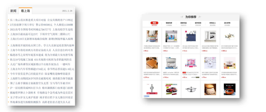
<div class="box">
<div class="left"></div>
<div class="right">
<ul>
<li></li>
<li></li>
<li></li>
<li></li>
<li></li>
<li></li>
<li></li>
<li></li>
</ul>
</div>
</div>
</body>
</html>- 示例:
html
<!DOCTYPE html>
<html lang="en">

<head>
  <meta charset="UTF-8">
  <meta content="IE=edge" http-equiv="X-UA-Compatible">
  <meta content="width=device-width, initial-scale=1.0" name="viewport">
  <title>Document</title>
  <style>
    * {
      margin: 0;
      padding: 0;
    }

    a {
      text-decoration: none;
    }

    ul {
      list-style: none;
    }

    .nav {
      margin: 50px auto;
      width: 640px;
      height: 50px;
      background-color: #ffc0cb;
    }

    .nav li {
      float: left;
    }

    .nav a {
      display: block;
      width: 80px;
      height: 50px;
      text-align: center;
      line-height: 50px;
      font-weight: bold;
      font-size: 16px;
      color: #fff;
    }

    .nav a:hover {
      background-color: #008000;
    }
  </style>
</head>

<body>
  <div class="nav">
    <ul>
      <li><a href="#">新闻1</a></li>
      <li><a href="#">新闻2</a></li>
      <li><a href="#">新闻3</a></li>
      <li><a href="#">新闻4</a></li>
      <li><a href="#">新闻5</a></li>
      <li><a href="#">新闻6</a></li>
      <li><a href="#">新闻7</a></li>
      <li><a href="#">新闻8</a></li>
    </ul>
  </div>
</body>

</html>第三章:清除浮动
3.1 元素浮动后的影响
- 对兄弟元素的影响:后面的兄弟元素,会占据浮动元素之前的位置,在浮动元素的下面;对前面的兄弟元素没有影响。
- 对父元素的影响:不能撑起父元素的高度,导致父元素的高度塌陷;但是父元素的宽度依然束缚浮动的元素。
3.2 清除浮动的介绍
含义:
清除浮动带来的影响,换言之,如果子元素浮动了,此时子元素不能撑开标准流的块级父元素。原因:子元素浮动后脱标,不占用标准流的位置。
目的:需要父元素有高度,从而不影响其他网页元素的布局。
示例:
html
<!DOCTYPE html>
<html lang="en">

<head>
  <meta charset="UTF-8">
  <meta content="IE=edge" http-equiv="X-UA-Compatible">
  <meta content="width=device-width, initial-scale=1.0" name="viewport">
  <title>受浮动影响的情况</title>
  <style>
    .top {
      margin: 0 auto;
      width: 1000px;
      /* height: 300px; */
      background-color: pink;
    }

    .left {
      float: left;
      width: 200px;
      height: 300px;
      background-color: #ccc;
    }

    .right {
      float: right;
      width: 790px;
      height: 300px;
      background-color: skyblue;
    }

    .bottom {
      height: 100px;
      background-color: green;
    }
  </style>
</head>

<body>
  <!-- 父子级标签,子级浮动,父级没有高度,后面的标准流盒子会受影响,会显示到上面的位置。 -->
  <div class="top">
    <div class="left"></div>
    <div class="right"></div>
  </div>
  <div class="bottom"></div>
</body>

</html>3.3 清除浮动的方法
3.3.1 直接设置父元素高度(不推荐)
- 优点:简单粗暴、方便。
- 缺点:有些布局中不能有固定元素高度,如:新闻列表、京东推荐模块。
3.3.2 额外标签法
操作:
- 在父元素内容的最后添加一个块级元素。
- 给添加的块级元素设置
clear:both;
缺点:会在页面中添加额外的标签,会让页面的 HTML 结构变得复杂。
示例:
html
<!DOCTYPE html>
<html lang="en">

<head>
  <meta charset="UTF-8">
  <meta content="IE=edge" http-equiv="X-UA-Compatible">
  <meta content="width=device-width, initial-scale=1.0" name="viewport">
  <title>额外标签法</title>
  <style>
    .top {
      margin: 0 auto;
      width: 1000px;
      /* height: 300px; */
      background-color: pink;
    }

    .left {
      float: left;
      width: 200px;
      height: 300px;
      background-color: #ccc;
    }

    .right {
      float: right;
      width: 790px;
      height: 300px;
      background-color: skyblue;
    }

    /* 清除浮动 */
    .clearfix {
      clear: both;
    }

    .bottom {
      height: 100px;
      background-color: green;
    }
  </style>
</head>

<body>
  <div class="top">
    <div class="left"></div>
    <div class="right"></div>
    <!-- 额外标签法 -->
    <div class="clearfix"></div>
  </div>
  <div class="bottom"></div>
</body>

</html>3.3.3 单伪元素清除法
- 操作:用伪元素替代额外标签。
css
/* 清除浮动 */
.clearfix::after {
    content: '';
    display: block;
    clear: both;
    /*  补充代码,使得在网页中看不到伪元素 */
    height: 0;
    visibility: hidden;
}优点:项目中使用,直接给标签加类即可清除浮动。
示例:
html
<!DOCTYPE html>
<html lang="en">

<head>
  <meta charset="UTF-8">
  <meta http-equiv="X-UA-Compatible" content="IE=edge">
  <meta name="viewport" content="width=device-width, initial-scale=1.0">
  <title>单伪元素标签法</title>
  <style>
    .top {
      margin: 0 auto;
      width: 1000px;
      /* height: 300px; */
      background-color: pink;
    }

    .left {
      float: left;
      width: 200px;
      height: 300px;
      background-color: #ccc;
    }

    .right {
      float: right;
      width: 790px;
      height: 300px;
      background-color: skyblue;
    }

    /* 单伪元素标签法 */
    .clearfix::after {
      content: '';
      display: block;
      clear: both;
      /*  补充代码,使得在网页中看不到伪元素 */
      height: 0;
      visibility: hidden;
    }

    .bottom {
      height: 100px;
      background-color: green;
    }
  </style>
</head>

<body>
  <div class="top clearfix">
    <div class="left"></div>
    <div class="right"></div>
  </div>
  <div class="bottom"></div>
</body>

</html>3.3.4 双伪元素清除法(推荐)
- 操作:
css
.clearfix::before,
.clearfix::after {
  content: '';
  display: table;
}

.clearfix::after {
  clear: both;
}优点:项目中使用,直接给标签加类即可清除浮动。
示例:
html
<!DOCTYPE html>
<html lang="en">

<head>
    <meta charset="UTF-8">
    <meta http-equiv="X-UA-Compatible" content="IE=edge">
    <meta name="viewport" content="width=device-width, initial-scale=1.0">
    <title>双伪元素标签法</title>
    <style>
        .top {
            margin: 0 auto;
            width: 1000px;
            /* height: 300px; */
            background-color: pink;
        }

        .left {
            float: left;
            width: 200px;
            height: 300px;
            background-color: #ccc;
        }

        .right {
            float: right;
            width: 790px;
            height: 300px;
            background-color: skyblue;
        }

        /* .clearfix::before 作用:解决外边距塌陷问题 */
        .clearfix::before,
        .clearfix::after {
            content: '';
            display: table;
        }

        /* 真正清除浮动的标签 */
        .clearfix::after {
            clear: both;
        }

        .bottom {
            height: 100px;
            background-color: green;
        }
    </style>
</head>

<body>
    <div class="top clearfix">
        <div class="left"></div>
        <div class="right"></div>
    </div>
    <div class="bottom"></div>
</body>

</html>3.3.5 给父元素设置 overflow:hideen
操作:给父元素设置
overflow:hideen。优点:方便。
示例:
html
<!DOCTYPE html>
<html lang="en">

<head>
  <meta charset="UTF-8">
  <meta http-equiv="X-UA-Compatible" content="IE=edge">
  <meta name="viewport" content="width=device-width, initial-scale=1.0">
  <title>给父元素设置 `overflow:hideen`</title>
  <style>
    .top {
      margin: 0 auto;
      width: 1000px;
      /* height: 300px; */
      background-color: pink;
    }

    .left {
      float: left;
      width: 200px;
      height: 300px;
      background-color: #ccc;
    }

    .right {
      float: right;
      width: 790px;
      height: 300px;
      background-color: skyblue;
    }

    /* 给父元素设置 `overflow:hideen` */
    .clearfix{
      overflow: hidden;
    }

    .bottom {
      height: 100px;
      background-color: green;
    }
  </style>
</head>

<body>
  <div class="top clearfix">
    <div class="left"></div>
    <div class="right"></div>
  </div>
  <div class="bottom"></div>
</body>

</html>3.4 使用浮动布局的原则
- 设置浮动的时候,兄弟元素要么全都浮动,要么全都不浮动。
3.5 布局练习
- 示例:
html
<!DOCTYPE html>
<html lang="en">
<head>
  <meta charset="UTF-8">
  <meta content="IE=edge" http-equiv="X-UA-Compatible">
  <meta content="width=device-width, initial-scale=1.0" name="viewport">
  <title>Title</title>
  <style>
    * {
      margin: 0;
      padding: 0;
      box-sizing: border-box;
    }

    .clearfix::before,
    .clearfix::after {
      content: '';
      display: table;
    }

    .clearfix::after {
      clear: both;
    }

    .wrapper {
      margin: 0 auto;
    }

    .top-bar {
      text-align: center;
      width: 960px;
      margin-top: 50px;
    }

    .top-bar .box {
      float: left;
      height: 80px;
      line-height: 80px;
      background-color: #ddd;
    }

    .top-bar .logo {
      width: 200px;
    }

    .top-bar .banner1 {
      width: 540px;
      margin: 0 10px;
    }

    .top-bar .banner2 {
      width: 200px;
    }

    .nav {
      width: 960px;
      height: 30px;
      background-color: #ddd;
      margin: 10px auto;
      text-align: center;
      line-height: 30px;
    }

    .main {
      width: 960px;
    }

    .main .left {
      float: left;
    }

    .main .left .top .item {
      float: left;
      width: 370px;
      height: 200px;
      border: 1px solid #000;
      margin-right: 10px;
      text-align: center;
      line-height: 200px;
    }

    .main .left .top .item:last-child {
      margin-right: 0;
    }

    .main .left .bottom {
      margin: 10px auto;
    }

    .main .left .bottom .item {
      float: left;
      width: 180px;
      height: 200px;
      border: 1px solid #000;
      margin-right: 10px;
      text-align: center;
      line-height: 200px;
    }

    .main .left .bottom .item:last-child {
      margin-right: 0;
    }

    .main .right {
      float: right;
    }

    .main .right .item {
      width: 200px;
      height: 130px;
      border: 1px solid #000;
      text-align: center;
      line-height: 130px;
    }

    .main .right .item:nth-child(2) {
      margin: 10px 0;
    }

    .footer {
      width: 960px;
      height: 60px;
      text-align: center;
      line-height: 60px;
      background-color: #ddd;
    }
  </style>
</head>
<body>
  <div class="top-bar clearfix wrapper">
    <div class="box logo">logo</div>
    <div class="box banner1">banner1</div>
    <div class="box banner2">banner2</div>
  </div>
  <div class="nav wrapper">菜单</div>
  <div class="main wrapper clearfix">
    <div class="left">
      <div class="top clearfix">
        <div class="item">栏目一</div>
        <div class="item">栏目二</div>
      </div>
      <div class="bottom clearfix">
        <div class="item">栏目三</div>
        <div class="item">栏目四</div>
        <div class="item">栏目五</div>
        <div class="item">栏目六</div>
      </div>
    </div>
    <div class="right">
      <div class="item">栏目七</div>
      <div class="item">栏目八</div>
      <div class="item">栏目九</div>
    </div>
  </div>
  <div class="footer wrapper">页脚</div>
</body>
</html>